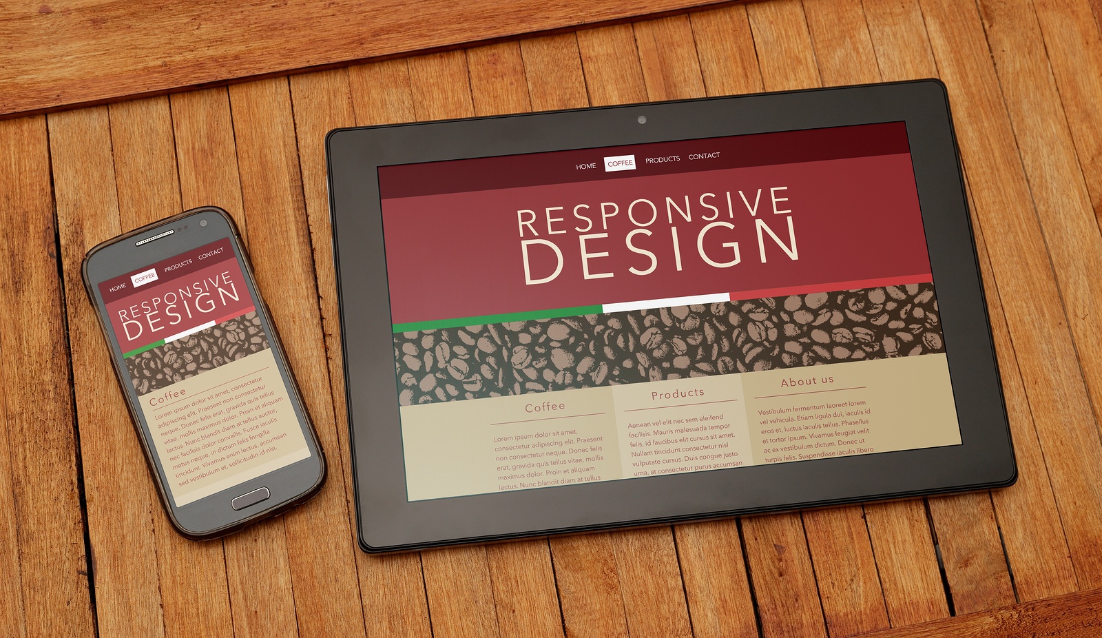
Recent Ofcom research reveals that over a quarter of adults and almost half of teenagers in the UK own a smartphone.
Another report carried out by YouGov found that 29% of adults in the UK own a tablet which equates to 12.2 million people.
With the growing smartphone and tablet ownership a large proportion of people in the UK get most of their online experience from devices other than traditional desktop computers.
In light of these statistics it has become increasingly important for websites to become accessible on whatever device it is being viewed with.
Because of the growing range of screen sizes and resolutions that are accessing the web today, designers have had to create websites that respond and adjust to retain their optimum usability whoever is viewing it and on whichever tablet or smartphone.
This new approach to website design is called Responsive Web Design.
Responsive Web Design uses media queries to ask the device about its viewing features and adjusts the design accordingly with fluid grids and conditional style sheets providing optimum browsing for every device.
What Does This Mean for Your Business Website?
Whatever the nature of your business, online presence has become an essential factor in attracting new customers and projecting a commercial profile of the services that you provide to potential users of your service.
As all businesses fight to try and get their online message heard above the competition, it has become increasingly challenging to grab the attention of browsers and potential customers.
One feature that consumers have come to expect from a modern website is a superior browsing experience no matter which device or smartphone they use to browse online content. Superior browsing means that your website will operate efficiently on all devices with the minimum amount of excessive scrolling and awkward handling.
This major shift in the consumption habits of internet users means that businesses who remain using static websites as their main source of online presence will find themselves left behind the competition.
How Can a Responsive Website Design benefit You?
Traditional website design has worked very well as a means to promote businesses for many years but the web consumer of today is increasingly mobile and demands an equality in browsing experience that desktop users have become accustomed to.
Web designers began to address this trend by designing mobile websites for the smart phones and with the popularity of tablets increasing, designers had to create yet another design to accommodate the tablet.
The obvious flaw in this approach is that you need to create three separate website designs and whenever your website needs updating you will have to update it three times. Having separate websites of repeated content also affects your search engine optimisation.
Even after you have finished developing a website for the phone, the tablet and the desktop computer, there is a wide variety of screen sizes amongst each of these mediums. Using this approach, you still cannot guarantee a perfect experience that allows the browser to access your useful content without the annoying left and right scrolling.
With Responsive Website Design you only need to create a single website which adapt to each device using media queries and flexible layouts. When you view a responsive website it will scale the images and adjust the content to fit on the screen whilst remaining readable.
Future Proof Websites
Customers viewing your responsive website on a tablet, mobile phone or computer screen will each receive an enjoyable user experience which means that they are more likely to remain reading your content and are more likely to share your website with friend and interested colleagues.
By providing a more user friendly website for all devices you will have an advantage over your competitors and also remain 'future proof' which means you wont have to re-create your website for another size of screen.
